• Building Surroundings : arch3373 : Rex : CoA@TTU body bgcolor="white" text="black" link="#99cccc">

    Wednesday, December 06, 2006

    FINAL FILE & FOLDER FORMAT (FF&FF)

    I have posted a .zip file to the right that unfolds to become your final submission folders. We will only grade out of this file and folder format. Write your version of the folders to a disc (DVD or CD). Print your name (LastFirstMI) and print 3373_F06 on the disc with indelible ink. Print out any new submissions on at least 11 by 17 paper and put your name on those submissions. Make sure that all these submssions are under my office door by Noon on December13th.

    Thanks.

    Wednesday, November 29, 2006

    Seeing the Seediness, and Celebrating It

    Architecture Review | 'Museum of Contemporary Art Detroit'
    Seeing the Seediness, and Celebrating It

    Fabrizio Costantini for The New York Times

    The Museum of Contemporary Art Detroit is housed in an abandoned car dealership on Woodward Avenue.

    Published: November 30, 2006

    DETROIT — Ever since the great suburban exodus of the postwar years, American cities have experienced varying degrees of panic about their identities. One result is that more and more cities have taken on many of the qualities of suburbs to survive. Meanwhile, the once-smooth surface of suburbia has cracked open, revealing a dark underbelly that once seemed to be the exclusive realm of the city.

    The new Museum of Contemporary Art Detroit is a radical rejoinder to this seismic shift. Housed in an abandoned car dealership on a barren strip of Woodward Avenue, it fits loosely into a decades-long effort to restore energy to an area that was abandoned during the white flight of the 1970s.

    But the design springs from a profound rethinking of what constitutes urban revitalization. Designed by Andrew Zago, its intentionally raw aesthetic is conceived as an act of guerrilla architecture, one that accepts decay as fact rather than attempt to create a false vision of urban density. By embracing reality, it could succeed where large-scale development has so far failed.

    Mr. Zago is uniquely positioned to grasp this context. Born in Detroit in 1958, he has vivid memories of the 1967 race riots that led the exodus of the white middle class. He remembers hearing white neighbors talk of fleeing to the suburbs as black families moved in. After departing with his family to a northern suburb, he saw the city decline to the point where it became a poster child of decay.

    Only later, as a practicing architect in the 1990s, did he begin to see these decrepit neighborhoods as a legitimate landscape for architectural experimentation. “I didn’t want to romanticize it,” he said during a recent tour of Detroit, “but the city had a depth of character, a real substance and integrity. And while you want to do away with the problems, you don’t want to lose that quality.”

    The museum, known as Mocad, presented his first opportunity to explore the tensions and ambiguities — between urban and suburban, resilience and decay — on a meaningful scale. The museum stands midway between the gargantuan Beaux-Arts structure that houses the venerated Detroit Institute of Art — a haunting symbol of the city’s faded civic aspirations — and a recently completed sports and entertainment district on the edge of the downtown business district.

    Anchored by Comerica Park, the home of the Detroit Tigers, the entertainment district’s gaudy signs, generic bars and trickle of pedestrians will be recognizable to anyone who has witnessed the transformation of America’s once-vibrant inner cities into generic shopping malls. It is an ersatz vision of the bustling metropolis, sanitized for visiting suburbanites.

    By comparison, Mr. Zago draws inspiration from the squatters’ houses, performance spaces, local bars and grass-roots art projects that have sprouted amid the disturbing stillness of the neighborhoods: a kind of forgotten underworld tucked into ruined houses and storefronts surrounded by lots that have been abandoned for so long that they have become overgrown fields.

    The architect had no interest in smoothing over the scars, which are worn as badges of pride. The gallery floor in what was once the car showroom retains its red octagonal tile; the other floors are raw concrete. Interior walls — collages of peeling paint, exposed brick and concrete block — have been left untouched so that you can see the traces of where they have been cut open and patched over during years of crude alterations. (Mr. Zago jokingly calls it his Frankenstein building.)

    To save money, he placed the museum’s mechanical systems, typically hidden atop the roof, in a corner of a gallery, wrapped in a chain link fence. Warmth is provided by a series of heat lamps suspended from the ceiling, as they might be in a public parking garage. Art works — a video by Kara Walker, a towering sculpture cobbled from the broken fragments of an old acoustical tile ceiling by Nari Ward — are scattered throughout the galleries with refreshing informality.

    The intentionally crude approach echoes museum projects like Frank Gehry’s Geffen Contemporary in Los Angeles (1982) and Michael Maltzan’s MoMA QNS, which served as a temporary home for the Museum of Modern Art from 2002 to 2004. Like those projects, resolutely informal, Mocad creates a casual and intimate relationship between art and viewer, shrugging off the weighty air of authority and privilege that is typical of so many museums. It takes us back to a time when making art and architecture could be a act of dissent.

    Mr. Zago reinforces that ethos by allowing the art to spill out joyfully onto the sidewalks. Big glass garage doors are set into the Garfield Street facade, which can be rolled up during the summer. For the opening of the museum, the graffiti artist Barry McGee spray-painted the brick facade with bold swirling letters. The graffiti echoes the colorfully painted convenience stores with Lotto signs that have sprouted up around Detroit in former brick bank buildings. (The city’s planning department tends to regard the signs as a form of architectural vandalism.)

    But Mocad also sets out to create a genuine community of art. Its three main galleries are arranged around a big room in which an informal bookstore and cafe were conceived as places to exchange ideas rather than a Starbucks for tourists. Its casual disorder affirms what the critic Dave Hickey once described as the social order that sustains any art community — “the way people talk about loving things, which things, and why.”

    Museum officials hope to raise $5.5 million for a more elaborate renovation by Mr. Zago that could be completed by 2010. Not surprisingly, his design for this second phase will be more formal than this, but not by much. All of the interior walls will be removed, yielding a big, open, flexible space with a series of small, boxlike galleries embedded along the main facade. A grid of enormous skylights shaped like canted parallelograms will puncture the roof. By projecting some of the skylights down into the space and others up above the roof, Mr. Zago lends character to the interior without creating a maze of walls.

    A series of canted windows will project from the Woodward Avenue facade, evoking the building’s previous life as a car dealership. A cafe will push out into the parking lot, which will become a sculpture garden.

    It remains to be seen whether Mr. Zago’s strategy will be the seed for similar developments. But Mocad is a powerful reminder that the neat distinction between the sterile suburbs and their urban counterpart is now dead. Mr. Zago finds meaning in the forgotten landscape between the two: a terrain that makes room for renegades and outcasts, as the urban metropolis once did.

    Models:

    Don't forget to take your model if it's leaning against a wall.

    B.

    Tuesday, November 14, 2006

    Ex #5: Site Plan Drawing

    Charge

    The city is made up of blocks and the streets between them. Within these blocks there are lots and properties and usages and zoning. Each block contains a scale of the units that make up a block. Some blocks are made up of lines of about 12 single family houses set back to back. Some blocks are made up of one industrial site, flea-market, or a city park, others are split across an alley to make back to back retail sites.

    What is the most simple urban component of your block?
    Select one of these urban components in your working area as your focus site.

    What is the street address of your subject property?

    Make a site plan for the property at 1”=10’ on 24 by 36 paper with a 2 inch border on each edge. Fit as much of your subject site into this frame. If your site is smaller than the frame then draw the properties and buildings surrounding your site with little or no detail.
    To complete this drawing you will need to use the files available to you on the class web page. There are illustrator, DWG, and FmZ files of the standard drawing sheet prescribed for this assignment. You will find the zoning ordinances explaining the setbacks and restrictions on the site in pdf format. You will find aerial photographs and city government created DWG formated subdivision plans to use as a base drawing.
    You will find the legal description, metes and bounds, plot plan, any deed restrictions, easements, and the lot/block/subdivision description of your site at the Municipal Building behind American State Bank off of Avenue Q downtown. Drew Paxton, a current architecture student at TTU, is the person you want to talk to, if possible. I’ve sent him a copy of this assignment and he was in my site planning class a few years ago.
    You will submit this project for grading as a high resolution vector based .pdf file. You must complete your drawing in a vector based program (Form•Z, AutoCad, or illustrator.


    Site Plan Information Checklist

    Set up one of the base drawings I’ve provided as your foundation and fill in all of the appropriate blanks I’ve left for you in the title blocks.

    Draw the property lines and right of way centerlines according to the metes & bounds description and plot plan. Use a long short long line for the property lines (PL). Put a small hollow circle at the juncture of each PL. Write the metes & bounds description parallel and just to the outside of each PL. Leave space to the right of this plan for a site section and a description of the metes & bounds.

    Locate all of the setbacks according to the zoning of the property- Front Yard, Rear Yard, and Side Yard. Check the plat map at City Hall for any registered easements. Draw all of the relevant setbacks on the property as a long, light dashed line. Draw a long medium weight dashed box around all easement areas on your site.

    Locate the structures on the site. Draw the footprint of the enclosed structure of the building with a heavy solid line. Use a medium solid line for all the areas that are in the building but not enclosed. Draw a short dashed light line for the limit of overhangs and other overhead structures.

    a solid, black, light line, draw in all of the flatwork (concrete surfaces) on the site including the front and back of the curb, sidewalks, porches, driveways, and patios. Notate all parking patterns and other vehicular guidance signs painted on the ground.

    Using the subdivision drawings compiled by the city government and posted on the class website, locate, copy, and trim contour lines into the drawing to indicate topography. Estimate the height above sea level (asl) for each finished floor and note it on each building in a rectangular box.

    Locate all minor interventions and vegetation such as fences, enclosures, gardens, raised planter beds, ramps, and site stairs, hedges, tree canopies and trunks.

    To the right side of the drawing project a site section through the primary building in the site. Make the section line (the line where air meets stuff) a black heavy line or “poché” the ground.

    Notate the plan and section liberally but discretely with a logical notation system.

    Write the metes & bounds out on the drawing where they best fit the sheet.

    Once you’ve proofed and edited the final drawing convert it to a high resolution 24 by 36 by 150 dpi .pdf file.

    Site Plan Format

    The site plan you will draw will be output to a 24 by 36 sheet of bond paper. Each edge of the sheet will have a 2 inch border. All of the text is "Arial" or "Arial Black" fonts. Here is a sample layout:(Click on image for detailed file)

    Ex #4: Cataloging Assignment

    The Excel spreadsheet files are linked to the right as EX#4: Catalog Templates.
    Please fill in all appropriate numbers. Grey areas will tabulate automatically.
    Be sure to replace "Student Name" and "Block Number" in the header with your relevant information. You will turn in a zipped folder of your version of these spread sheets for this assignment. We will compile the results.

    Due date: 21 November. We'll let you know where to send your files.

    Friday, November 10, 2006

    Models:

    If you re-submitted your model please make sure that you did put a note on your model saying so. If you did and it's not there anymore, make sure to put a new one.

    B.

    Wednesday, November 01, 2006

    Re-do:

    Figure-Grounds and Mappings are due tomorrow, Thursday November 2nd during class.

    B.

    Sunday, October 22, 2006

    Figure-Ground Studies:

    The following people should redo their figure-ground study:

    1. Charles Gilmore
    2. LaSalle Tippens
    3. Daniel Aghili
    4. Chelsea Barnett
    5. Chris Davison
    6. Alex Lopez
    7. Bryan Jacobsen
    8. Favian Barron
    9. Claire Tranter
    10. Neil Jackson
    11. Lindsay Akins
    12. Devin Dozier
    13. Erik Guaderrama
    14. Trent Oatman
    15. Christopher Martin

    Reasons you should redo your figure-ground study:

    1. Having more than the following three colors:
    a. white
    b. gray
    c. black
    *You should only have ONE shade of gray, no more, no less. And be elegant when choosing your shade of gray.
    2. Using double lines where they are not appropriate.
    3. Trees eating buildings or trees growing inside of buildings. Trees have a trunk and that trunk is a figure. Trees are circles, not ellipses.
    4. Having a different colored line for something that's hatched is wrong. For example, if you had a circle with a black line and then hatched it gray, this is wrong. The line should be the same color as the hatched space.
    5. If trees intersect then they should make one continuous form.
    6. If you put topography lines in your figure ground, take them out.
    7. Streets, side walks, curbs, etc. are not figures.
    8. As always, don't use Photoshop. Use Illustrator.
    9. There should be no text what-so-ever on your figure-ground.
    10. Buildings (figures) should have sharp edges; no fillet.
    11. Make sure you're printing at the right scale.
    12. Fences should be dashed lines and should have an appropriate scale to them. Again, be prudent when choosing a scale.
    13. When it comes to poles, be as accurate as you can about their size and do not make them black and an actual figure (a building, for example) gray. There is a hierarchy of figures.
    14. There should be NO symbols on these studies. It is a figure-ground study.

    Everyone is welcome to improve their figure-ground study. Do not put them in the pile. Bring your new ones on Tuesday to class. As always, if you have any questions about the assignment or your own work email me or find me so I can lead you on the right path.

    B.

    Thursday, October 19, 2006

    Models:

    If you are going to do anything to your model you can do so now. Make sure to do it before Sunday at 12 PM. Your model must be on the 8th floor on Sunday at 12 PM.

    B.

    Wednesday, October 18, 2006

    Tomorrow's Class:

    We will meet on the 8th floor of the Architecture Building at 11:00 AM. Make sure to bring your model with you.

    B.

    Thursday, October 12, 2006

    Acacia Hardwoods Inc.
    6414 FM 1585
    Lubbock, TX 79424
    (806) 794 5099

    Home Depot
    2615 50TH STREET
    Lubbock, TX 79416
    (806) 791-4102

    Pan-Tex Plywood and Hardwood
    116 E 42nd St
    Lubbock, TX 79404
    (806) 747-2561

    Acacia sells 1/4" MDF 4x8 for $9.95.

    Home Depot sells 1/4" MDF 2x4 for $2.99.

    Pan-Tex sells 1/4" MDF 4x8 for $9.00.

    B.

    Thursday, October 05, 2006

    Request to City GIS Office

    Susan:

    Thanks for your help in your email of September 12, 2006. I am teaching a class this semester in site design. We're using a location in Lubbock, the area around Burns Park just south of downtown, as a subject site to draw and study. In this work we talk a lot about what what was intended to be done, what should be, and what is actually "there" when we work on a site.

    I have lived in many cities in my years, Dallas, New York, Montréal, Berlin, Dublin, Denver, Norman OK, and Lincoln, NE. LBB certainly has the best publicly accessible aerials and maps of anywhere except maybe Berlin. Over here at the college of architecture we enjoy and use your collection more than you may know.

    We've been looking at the urban morphology of this "near south" neighborhood, how the city seems to have made it's first real extension south to 23rd St and west of Texas, etc. etc. We've been looking at the shifts in the right of way in J, L, and L at 23rd.

    Your maps and aerials are excellent for figuring out "what's there." Is there a way to find out exactly how it was meant to be laid out short of coming in and studying each separate subdivision plat?

    We do have a problem though, we don't have the ability to read dgn files here in the college. We gave up all the microstation type stuff a while back in architecture and use the dxf/dwg files these days. We're not that smart.

    What I'd like to know are the centerline to centerline dimensions of the right of ways:
    a) South of 23rd and running from east to west:
    between Buddy Holly and Texas
    between Texas and J
    between J and K
    between K and L
    between L and M
    between M and N
    b) South of 23rd and running from east to west:
    between Buddy Holly and Texas
    between Texas and J
    between J and K
    between K and L
    between L and M
    between M and N
    c) Running north to south:
    between 22nd and 23rd
    between 23rd and 24th
    between 24th and 25th

    I can get the width of the right of ways off the 1957 Sanborn Maps and Parks and Rec plans of the park.
    Can you help me with these dimensions?
    I have two teaching assistants, who are cc'd on this email, that can do the research if you can point us in the right direction.

    Monday, October 02, 2006

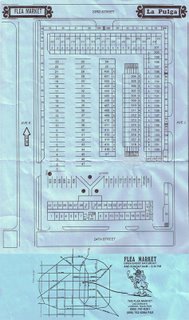
    Flea Market images

    (B.'s images were beating up my web page so I moved the images to a link in the left column, Brian)


    Sunday I went to visit with Nan and get more information about the Flea Market. She gave me a lot of things. Here's some stuff:

    This is an aerial photograph of the flea market before the new Red Building was built.

    This is a top view of the Flea Market before 1995.

    The Flea Market under construction.

    This is an Avalanche Journal news article on the Flea Market.

    These are images of the indoor Flea Market before the fire in 1995.

    This is a picture of Hulen Penny, the man who bought the Boys' Club and turned it into a Flea Market. He was known for always wearing overalls.


    This is a picture of a man who'd park in front of the Flea Market and sell tamales without paying Hulen nor the city. According to Nan this made her father, Hulen, very mad. She calls this a "Ha-ha picture." She laughs about the situation now.

    This is an Avalanche Journal news article on the fire.


    These are pictures of the fire.

    We'll talk further about this during class.

    B.
    Monday, September 25, 2006

    CLASS WORK DAY- TUESDAY

    Tuesday will be a work day.
    Michael and B. will be available to you during class time in the classroom.
    Take the opportunity to visit with them and ask them questions about your Exercise #1- which is due Thursday at the beginning of class. No roll will be taken.

    ON THURSDAY WE WILL MEET IN THE CLASSROOM, NOT AT THE SITE.

    Sunday, September 24, 2006

    Base Maps

    I can't explain why the base files were password protected. I've never made a password protected file before. I've changed the download options so that you can download each one of the file types seperately. I think the server didn't like the foot sign, equals sign or some other special symbol I had in the file name. Let me know if it doesn't work for you. Thanks to S.R. for alerting me to the problem.

    Friday, September 22, 2006

    Base Maps, Due Date, Class Locations, & Seminar

    I have uploaded the .zip file with the Ex#1 base maps inside.
    This assignment will be due Thursday, September 26th at 11:15AM on site.
    The submission will be one 11 by 17 print out with title block, north arrow, and graphic scale. (As I said in class, it is my intention to use the best design as the standard titleblock for ALL future work done in this class.)
    I have updated the class schedule at right to clearly say when we'll be in class on Thursdays.
    Michael will do a seminar in how to use Illustrator at 1:00PM Friday (today) in room 802.

    Again, sorry about that location confusion.

    Sunday, September 17, 2006

    Flea Market Map


    Beatriz and I had a very enlightening and enjoyable sit down with Nan Penney (maiden name- I can't remember her married name, sorry) whose father built the flea market over 30 years time. As with Old Town, it was a struggle with the city government to make it work.

    The history is happenstance. The Old Boy's Club moved out of their facilities when the children in the neighborhood aged and the audience was no longer in the neighborhood. They moved south in the early 1970's. The vacant building was bought by Hulen Penney, a successful real estate broker, to be used as a flea market. In the former ball fields next to the building he built some mini-storage buildings- a building type that arose in the mid-1970's across the country. What happened was the people renting the mini-storage facility started asking him if they could sell out of their spaces during the flea market. COOL!
    The Boy's Club building burned to the ground in 1995, shifting the emphasis of the flea market over to those mini-storage facilities.

    So, like almost everything we run across here in Lubbock, the flea market as we see it today is not designed to serve a flea market program. It is a hodge podge of shifting uses in everyday life. It's never been designed.

    There's more to the rich history of the site that we'll fill you all in.

    For those of you enjoying the facilities at Old Town we have a special guest for you to meet soon- Michelle, who works at the flea market and along with her two kids and husband lives directly behind the flea market. She has some interesting insight for you about what her family's witnessed living near Old Town.

    I've received some angry looks and attitude from a few of you regarding this matter. I'll take any further "guff" from any of you as aggression and move this matter over to Student Judicial Affairs for thier review. It's bullying and anti-academic.

    Michelle tells of a weekend party that ran 24/7 from Thursday afternoon until Sunday afternoon during exam time last year. Maybe we should invite a leader of the Greeks who make up this constituency into our class for a discussion. Certainly, they are a constituency. I'd really like them to come out and meet their neighbors.

    We have a great constituency group to work with now:
    District Councilman Floyd Price
    Pastor Gerald Jackson and the congregation of Central Lubbock Church of Christ
    Bobby Wilson of Old Town
    Nan and Michelle, as well as many of the merchants, at Mercado La Pulga (The Fleamarket)

    Nan is eager to see us bring our work out to the market to show people what we're doing.

    Hat's off to B.

    Saturday, September 16, 2006

    Note:

    If you're going to the site (whether you're on Burns Park, the Flea Market, or elsewhere) make sure that you introduce yourself and explain what it is you're doing before you take a picture or stand there for more than 30 seconds (while observing something, for example). If someone doesn't want to be photographed or would like you to leave then make a note of it and move on.

    B.

    Law Still on the Books

    from the Daily Torreador, 4/6/06, series: Lubbock After Dark, author: Ruth Bradley-

    In 1923, the city of Lubbock issued Ordinance No. 225, prohibiting persons with 1/8 or more black blood from living or owning property anywhere south of 16th Street and East of Avenue C, with the exception of hired servants. Violation of the ordinance was punishable by a fine of not more than $200, with each day lived outside the district considered a separate offense. The ordinance states that blacks living outside this area are a threat and that "their residence is dangerous to the health and pollutes the earth and atmosphere."

    Saturday, September 09, 2006

    Read This

    New York Times / dateline: New York, September 10, 2006
    Putting Whole Teeming Cities on the Drawing Board
    By NICOLAI OUROUSSOFF

    BUILDINGS are looking prettier than ever, thanks to the freedom that contemporary architects have these days to play with form. Meanwhile, many of our cities are falling to pieces, as the infrastructure that once bound them into functioning communities crumbles from years of neglect.

    New Orleans exposed a breakdown in infrastructure and social policy that will not be repaired by a conventional formula of tourism, architectural nostalgia and gated communities. And the atomization of cities as diverse as Dubai, Beijing and Beirut, where the construction of glistening new urban centers masks growing social inequities at their edges, have only further exposed the hollowness of some contemporary urban-planning strategies.

    So the most promising trend this year is a renewed emphasis in architectural circles on urbanism as a field for creative exploration. Architects like Eyal Weisman (in London), Teddy Cruz (San Diego), Philipp Oswalt (Berlin) and Rem Koolhaas (Rotterdam and just about everywhere else) have been striving to bridge the gap between architectural fantasy and stark political and social realities. Seeking to distance themselves from the current obsession with “star” buildings, they proceed from the assumption that we cannot create valid new architectural forms until we arrive at a deeper understanding of the era we live in.

    The 10th Venice Biennale of Architecture, which opens this weekend, is the first to focus on entire cities rather than uncovering the latest architectural trends. Organized by Ricky Burdett, the exposition examines the effect of design in cities as diverse as Cairo, Mumbai, São Paolo, Johannesburg, Mexico City and Caracas.

    Among the highlights is Al-Azhar Park in Cairo, conceived as an “urban lung” to provide relief for a city that has only one square meter of green space for each inhabitant, and a series of schools in São Paolo that function as around-the-clock community centers to help reduce violence among youths in the poorest slums. (Simply getting children off the streets is a starting point.) “I think projects like this give a raison d’être to architecture again, which is what the profession is looking for,” Mr. Burdett said.

    In “Lago: How It Works,” a book to be published this fall, Mr. Koolhaas turns his penetrating gaze to the Nigerian city, a dense matrix of congested slums and infill markets that in many cases have devised their own court systems and electricity and water utilities.

    In the 1970’s Lagos was the nexus of a stirring intellectual renaissance and a wave of sprawling, megalomaniacal urban planning projects. That optimism evaporated with the drop in oil prices at the end of the decade, and the city was left to fend for itself.

    Today, the Nigerian government is trying to resurrect some of the old planning projects, clamp down on illegal street trade and rein in urban indiscipline in general. Yet in eight years of research, Mr. Koolhaas realized that what seems like chaos to outsiders is a complex and highly organized social organism. His analysis suggests that a democratic, informal urban planning model could be combined with aggressive planning to lift Lagos out of poverty without destroying the spontaneous freedom of daily urban life.

    “In Lagos there is no choice, but there are countless ways to articulate the condition of no choice,” Mr. Koolhaas has said. “In New York, on the other hand, there’s a sense of infinite choice, but a very conventional set of options from which to choose.”

    Of course Mr. Koolhaas, now 62, has been known for countering conventional wisdom about how cities really work since the publication of “Delirious New York,’’ a 1978 book casting the “city of congestion” as an antidote to the sterility of Modernist planning conventions. Today, he is joined by a younger generation of architects who are no longer content to consider architecture in isolation from larger urban patterns. Among them is Mr. Oswalt, 42, who has organized a show that arrives in December at the Van Alen Institute in New York and the Pratt Manhattan Gallery. Titled “Shrinking Cities,” it examines the shrinking industrial centers on the fringes of the emerging global economy.

    The show sheds light on the abysmal failure of planners to avert the gradual disintegration of cities like Leipzig, Germany; Ivanovo, Russia; and Detroit. The phenomenon of decay is often juxtaposed with a different form of assault: the insidious encroachment of suburban values. New Yorkers need only stroll through SoHo to get the point.

    The exhibition, which originally opened in Berlin 2004, also resurrects some largely forgotten critiques of urbanization. It touches on the Disurbanist proposals of Soviet Constructivists like Moisei Ginzburg and Mikhail Barshch, who challenged the thinking behind Western urban traditions in favor of a more rural Russian model, and Frank Lloyd Wright’s Broadacre City, in which each family would be allotted an acre of land and the agglomeration would serve as a decentralized metropolis.

    But the show’s most penetrating attacks are reserved for more recent urban strategies, particularly the argument that the salvation of cities rests in a so-called “creative class” that leads the way to gentrification.

    “Shrinking Cities” is to travel in February to Detroit, where, a bit paradoxically, it will go on view in an abandoned 21,000-square-foot warehouse that will be the temporary home of the Museum of Contemporary Art Detroit. Designed by Andrew Zago, the museum is being opened, in part, with the goal of revitalizing the city center.

    Finally, Mr. Weisman, an Israeli-born architect who is the recipient this year of the prestigious Stirling Prize for architecture, will open a series of lectures this fall at the Canadian Center for Architecture in Montreal. The talks are pegged to the release of “Hollow Land: The Architecture of Israeli Occupation,” a chilling book in which he explores the way the military selects targets in bombing and fortifying cities and how those strategies can re-emerge in civilian planning practices during peacetime.

    His analysis is ideally timed. If the Modernist mass-housing programs of a half-century ago reduced a generation of urban poor to mere numbers in a machine, many of those projects are now being wiped away to make room for an equally troubling formula: gated communities, open-air malls and sanitized tourist enclaves that have exacerbated social inequities by making destitute children invisible.

    Acknowledging the complexity of these issues is not enough. Thankfully, some architects have assumed the challenge of binding us back into a civilization whose fabric often seems on the verge of unraveling.

    Tuesday, September 05, 2006

    For Thursday

    Before class listen to the WBEZ "This American Life" show on mapping and it's agencies.
    A link is provided to the right.
    Begin thinking about the quality / quantity of the site that you will isolate and measure with an instrument.
    Meet in Burns Park at 11:15AM on Thursday. Come dressed appropriately and be prepared to take notes while walking around the site area.

    Monday, September 04, 2006

    Syllabus Update

    I have updated the class syllabus after consultation with some of the service-learning mentors on campus. Rather than have you post your reflections on meeting with the community on-line immediately, I've revised the assignment so it requires you to turn these reflections in as print documents. Once we've received them we'll ask select reflectors (with student approval or anonymously) to publish their reflection on the class page. So the assignment now reads:

    b) TX Ave. Market Park / Community Reflections (24 points - 24% of total grade)
    The class web site is at: http://3373.blogspot.com/ Over the course of the last two-thirds of the semester a series of events and visits will bring the local community and your efforts together for discussion and dialog. Twice in the semester you will be a part of one of these dialogs. You will take careful notes for at these meetings. Once you’ve had a meeting you will select a key image from your work that seems to have “resonance” with what came from your community meeting and you will reflect on what you took away from the dialog. On a single sheet of paper you will paste this image from your drawings and model shown to the community in the top third of the sheet of paper, list those present, the time and date, and you will write (11pt Ariel/Helvetica) a commentary below that on how you think your work was understood and taken in context in the meeting. Select presentations will be asked to post their reflections on the class weblog for further comment and discussion.

    Changing the syllabus of a class once the semester has begun requires the full "buy-in" of the students in the course. The change was made to allow you all to be more candid and private in your reflections. That's all. Anyone who has questions or disapproves of that revision should do so via email to me by Thursday at the beginning of class.

    Sunday, September 03, 2006

    Reading Assignment

    As stated in our last class:
    Read "The Beholding Eye" by D. W. Meinig.
    It can be downloaded from the right-hand column of this webpage.

    Thursday, August 31, 2006

    Market Comparisons

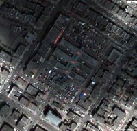
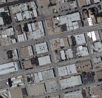
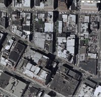
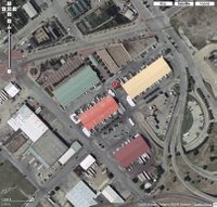
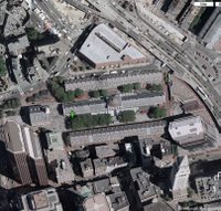
    All images are from Google and are presented at the same scale and with north at top of screen for comparison.
    Use the last image, Memorial Circle on the TTU campus, as a base reference.
    (Click on Images to Enlarge)
    Aerial view of class site- 6 blocks with 4 zones- residential, industrial, retail, and public park / Lubbock, TX
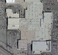
    South Plains Mall / Lubbock, TX
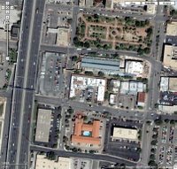
    Mercado / San Antonio, TX

    Marche Jean Talon / Montreal, Quebec (under a cloud cover)
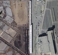
    Southern California Institute of Architecture (SCI-Arc)- White Bldg / Los Angeles, CA
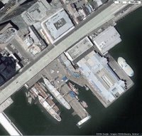

    South Street Seaport / Manhattan, NY

    Faneuil Hall Market / Boston, MA


    Deep Ellum District / Dallas, TX

    Fulton Street Shopping District / Brooklyn, NYC
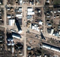
    Main Street and Railroad Avenue- Main St (N-S) serves civic functions, RR Ave serves commercially / Eustis, NE

    Cleveland Arcades / Cleveland, OH

    Dallas Farmer's Market- wholesale market transformed with a local tourism focus / Downtown Dallas
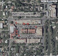
    Highland Park Village- the first car centered shopping center / Highland Park TX


    Riverwalk-
    Alamo in upper right (NE) corner / San Antonio TX
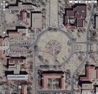
    Memorial Circle, Texas Tech University / Lubbock, TX
    About posting on this blog:

    3373 students:

    Whenever you post anything about the site make sure to put an image to show what it is you're writing about and vice versa when posting a picture.

    B, 3373 TA

    Wednesday, August 23, 2006

    This Semester's Project - Intro


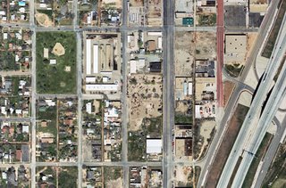
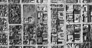
    This year's SURROUNDINGS project is bounded between Burns Park and I-27 in Lubbock, TX. The primary uses today to the east of the park are flea market and parking. Surrounding the park on the N, S, and W sides are homes. Our course goals are to complete a comprehensive study of the neighborhood and to project some alternative tenancies in the voids.

    The Burns Park area hasn't always looked the way it does today. Here's a 1958 aerial photo that shows the park to be a vibrant and tree filled park. Where the empty field and large building were (what was that building?) is now the flea market.